Posts

Showing posts from October, 2020

GIS 4035 - Module 1 - Visual Interpretation
Image
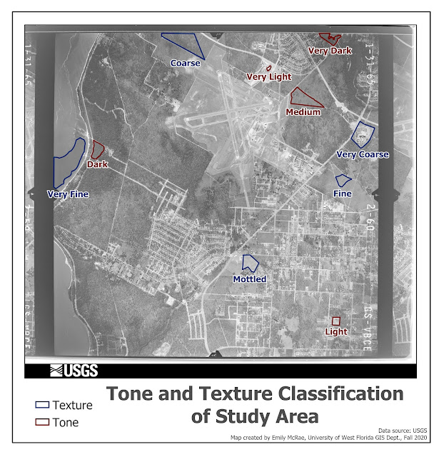
This map demonstrates, through a grey scale aerial image, how one can classify features on a landscape visually using tone and texture. Tone being the scale of lightness to darkness and texture being a scale of very coarse to very fine. These classifications were done by eye, and may be subjective to the analysts interpretation, as well as the images clarity, scale, and resolution. This map identifies features in a greyscale aerial photo by 4 means: pattern (Objects/places were chosen that are clearly visible and interpretable as they are part of a larger repeating pattern, but that had they been presented in isolation or at a very large scale, would not be clear as to what they are), shadows (Objects were chosen which could not have been identified had they not been casting a shadow which revealed information about what the object is), association (Objects were chosen that could not be identified without looking at the surrounding environment and making logical connections about what

GIS 5935 Module 6

Image
This lab explores the complexities in representing real geographic phenomena accurately, both in terms of physical features and socioeconomic or other patterns, based on decision made by the cartographer. It looks at the distortions that can occur when data are displayed at varying scales, resolutions, and the very interesting and perplexing issue of the modified area unit problem (MAUP). The MAUP is an of yet, unsolved issue in spatial analysis, by which aggregation at different boundaries can yield very different results for analysis. This can even be exploited with gerrymandering, a practice of drawing political boundaries to intentionally to group voters and representation in favor of a political party.  This lab looked at the affects of scale on vector data, resolution on raster data, and measuring the degree of gerrymandering in congressional districts within the contiguous US. I will briefly detail the analysis process for each, and provide examples and explanations of the findi

GIS 5935 Module 5

Image
This weeks module focused on surface interpolation using the Spline, Thiessen, and Inverse Distance Weighted (IDW) methods.  In the example below, water quality sample points taken across Tampa Bay were used as input data and run through the 3 surface interpolation methods to get an understand of water quality across the entire Tampa Bay study area. The methods are compared based on their ability to achieve a good impression of what water quality may actually look like across the surface.  I will detail how each method works,  their strengths and limitations as it applies to this example, and the result of this method when applied to Tampa Bay water quality assessment.  I will note that none of these methods take into account other highly influential factors of the water landscape including flow direction, elevation, watershed, aquifer boundaries, etc.  Spline Conceptually, how it works: The spline method interpolated the value of the surface where data points are not recorded, by pas